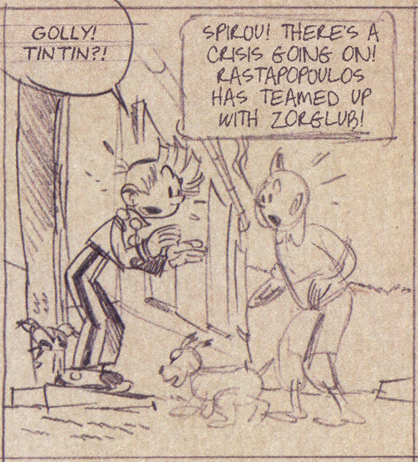
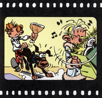
Journal de Spirou #4078 (8. June, 2016) is actually the four thousandth issue of the Journal (because when the magazine adopted continuing numbering instead of within-year numbering after the war, they simply counted the number of weeks since the first issue, even if no magazine had come out that week). For this occasion, the magazine features a selection of “scoops” from the history of the magazine, as told and illustrated by Fred Neidhardt. This includes a crossover between Spirou and Tintin!
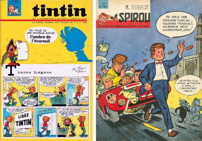
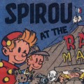
Tintin and Spirou were published in competing magazines each named after the character. In 1965, the two rivals collaborated on an April Fools gag where they “switched covers”, each adapting the style and layout of the other:
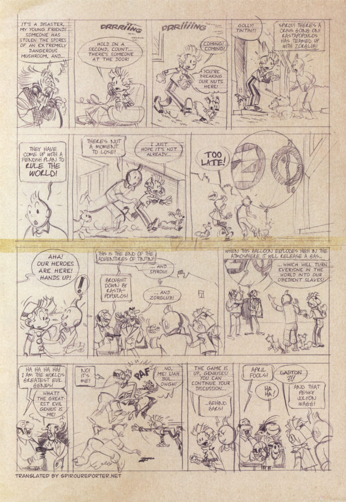
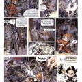
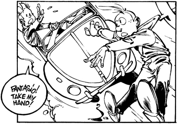
The story goes that Franquin and Hergé wanted to take the joke further, creating a crossover one-pager in collaboration. However, the idea was shot down by the editors of the respective magazines, and the pencil sketches have remained hidden in the Dupuis archives until now:
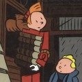
Of course, this is another of Neidhardt’s little hoaxes. The Spirou drawings are copied from various Franquin albums (you may recognize the pose in the “Hands up!” panel from QRN sur Bretzelburg, for example), and the supporting documentation is all faked (including a video clip where they supposedly talk about it, but which is very clearly overdubbed).
Still, it got us a Spirou–Tintin crossover, even if it had to fake it!

Michel Demoustier liked this on Facebook.
Jan Hoff liked this on Facebook.
Vidar Bratlund-mæland liked this on Facebook.
Joakim Gunnarsson liked this on Facebook.
Kevin Scandereberg liked this on Facebook.
Jofrid Sandgren Østenstad liked this on Facebook.
Emily Stewart liked this on Facebook.
Trond Gulvik Larsen liked this on Facebook.
Emi Farmosi liked this on Facebook.
Sarah Joy liked this on Facebook.
Juanjo Rodríguez liked this on Facebook.
Not bad for a belated April Fool!
Bernardita Martínez Martínez liked this on Facebook.
Spirou Reporter | Scanlation Sunday: The Big Crossover https://t.co/YNlnLaKc3s
Kalle Id liked this on Facebook.
Thomas Karlsson liked this on Facebook.
Akane Varkos liked this on Facebook.
Helge Kvingedal liked this on Facebook.
Pff… How would Gaston fit behind a Zorglub mask… he has a very different face structure… A bit of an anti-climax. But the scanlation is great! It are fitting fonts, and the colour of the letters looks realistic.
Thanks! Yeah, it came out pretty good, I think. There are a couple of things I could have done to blend the lettering even better, but I was very happy with the paper texture in the speech bubbles. Textured speech bubbles are always tricky, because there’s no simple way to remove the text without also losing the texture (the spot healing brush tends to create ugly artifacts), and if the paper shade varies like it does here, it’s time-consuming to make the fill-in blend properly. But here I was able to come up with a process that doesn’t require a ton of manual editing, except for some retouching around the tape and for the text baselines, and that looks pretty much spot-on.
David Seignobos liked this on Facebook.
Friedrich Ulf Röhrer-Ertl liked this on Facebook.
Jean-Benoît Meybeck liked this on Facebook.
Nice job!
Thanks! Always great to hear from the artists of the comics. Nice job on the fake! 😉
Kevin Huang liked this on Facebook.
Dimitri Yashida Varkos liked this on Facebook.