Today it has been two years since Spirou Reporter launched. Many thanks to all regular readers and occasional visitors! While the blog is on something of a hiatus right now (for a number of different reasons, including work and other commitments, seasonal allergies, and certain technical difficulties), we’ll hopefully resume our regular schedule towards the end of the month.
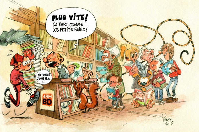
(The illustration doesn’t have anything directly to do with the announcement: it’s from an advertisement for an event earlier this month when lots of comics were on sale for just 1 EUR, to benefit schools and libraries. I just thought it was a nice picture to liven up this post!)

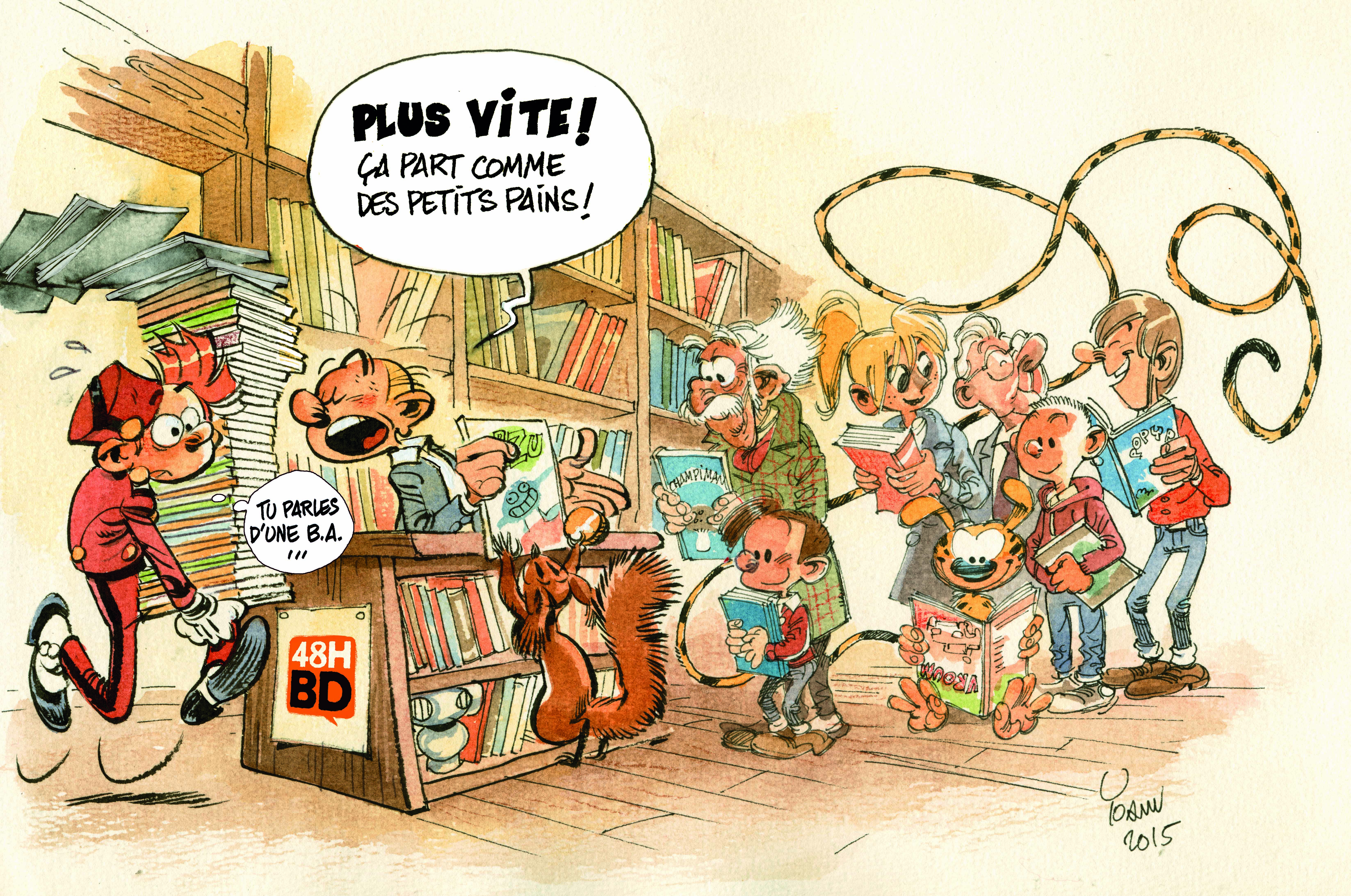



It IS a really nice image, for sure. I wish the inner pages of the albums had, if not this coloring technique, at least this level of quality. Going recently through the Tome&Janry stories and comparing their splendid colours with the ones in more recent albums is quite appalling..
It might partially be due to editorial choice, however. (As well as deadlines/ publishing schedules…) Flat colors are easier to read in the long run.
Hopefully, the colors’ll be quite appealing in upcoming albums…
I actually find the color balance to be way off here (at least in this version; it looks much better in print), as if someone has taken a slightly dull watercolor job and simply cranked up the saturation, blowing out the reds in the process.
The coloring in recent Spirou albums has been extremely hit-and-miss in my opinion. Some look perfectly fine, others are pretty hideous. I do agree that almost nothing holds a candle to Stéphane de Becker’s work on the Tome & Janry albums (e.g. the gorgeous Pacific vistas in the upcoming “Bad Luck Vito”). As colors go, Stuf is the master!
At the risk of painting with too broad strokes (apologies for the pun), I’d say today’s computer-generated colors, paired with the otherwise inevitable glossy paper, tend to make the pages look garish.
You read my mind here: Stéphane de Becker’s coloring on the T&J albums was just as good as you can get. Please, someone call their office and bring him back!
Stuf might be up to snuff, but he might be too busy with other things. He’s drawing his own series “Passe–moi l’ciel” and assists Tome & Janry on “Le petit Spirou” (perhaps with coloring).
Oh, and happy birthday!
Bon anniversiare! Congratulations on another year running this great blog and I’m really glad to hear it’s set to continue. I love that image, Spip on his tip toes buying his little comic is just the cutest thing.