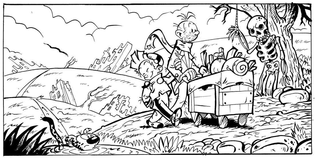
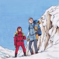
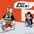
The Animation Workshop, an animation school in Denmark, posted this on Facebook last week. Students in their Graphic Storytelling program were given the exercise to adapt part of Cormac McCarthy’s super-depressing post-apocalyptic novel The Road… in the style of Franquin! The task might have been easier if they could base it on the later style that he used in the morbid Idées noires gags (“Franquin’s Last Laugh“), but no, apparently it had to be 1950s Franquin as seen in Spirou. This was one of the resulting entries:

Spirou (playing the part of The Boy) is looking unaccountably chipper there! If any of the students who took part in the exercise want to share some more samples, that would be very much appreciated.

Helge Kvingedal liked this on Facebook.
Gosh, that’s well observed, right down to Spirou and Fantasio having different types of noses and ears, and the line-quality is great.
Although I am receiving the Spirou weekly magazine*, I do still get an awful lot – more, even – from your postings here. Thanks so much for all your work on this site!
*Your warning about/description of the magazine was spot-on. I hate this very American, ugly “Buck Danny” comic story a la “Top Gun” that is completely un-BD-y and just won’t end. The rest of it, though, is a good exercise in studying drawing styles. Seldom do the pieces reach the mastery of the Spirou books — which is fine, too, as there’s a lot to be said for the expressiveness of a loose cartooning flow.
I just wish I could read it! High school French is defenseless against the wordplay and contemporary lingo of these comics.
Yeah, if you look over on [url=http://www.inedispirou.com/forum/viewtopic.php?f=5&t=2052&start=25#p63048]InediSpirou[/url], the new Buck Danny has gotten a pretty harsh reception there as well. Words like “moche”, “totalement raté” and “hideux” fly. (Though on [url=http://www.spirou.com/forum/viewtopic.php?id=593]Spirou.com[/url], a number of people love it.) [i]Tous les goûts…[/i], as they say.
BD does actually have a tradition for comics like this: rather stiffly drawn realistic series set in very specific environments, often with a lot of emphasis on technical illustrations of planes and vehicles. In addition to Buck Danny you have Michel Vaillant (race car driver), Tanguy et Laverdure (pilots), Eric Castel (football player), Dan Cooper (pilot again), etc. [i]Journal Tintin[/i] specialized in this “genre” from the 50s to the 70s ([url=http://www.lambiek.net/magazines/tintin.htm]Lambiek[/url] has a good article about it). Of course, in most cases they were much better illustrated than this latest Buck Danny incarnation (check out some of Uderzo’s [i]Tanguy et Laverdure[/i] art to see how it should be done!). If you had any interest in the series, Cinebook have translated some of the [url=http://www.cinebook.co.uk/index.php?cPath=158]earlier albums[/url] by Francis Bergèse, which look a good deal better.
In recent issues of JDS, I think the high points have been [i]Tekila[/i] and the short [i]Poursuites en vrac[/i] (in the Nantes special issue). And I quite like [i]Les nombrils[/i].
Thanks for all the background information. It occurred to me on reading your reply that I’ve really very little basis on which to say what is or isn’t B-D; my comments say more about what I *like* in B-Ds!
There *is* often a high level of draughtsmanship, even in the more “cartoony” Franco-Belgian work. Coming from a cartooning background, now taking a much closer look at B-Ds, I must confess that I find that level of detail daunting — or I should say “inspiring.” (“Gosh, that Turbotraction is perfectly rendered!”) It’s neat that the characters still manage to fit with the intricate architecture and machinery.
But, yeah, Buck Danny and the crew look like they’re carved out of bologna, and the über-serious, “Rah, rah, machines of war!” stuff is lost on me. They remind me of that one awful comic that would always be stuck in the packages I got on family camping trips as a kid. “Swamp Thing? Ugh!”
Thanks also for all the links. “Tellement hideux” — I love it; even I can understand that! And now I’ve discovered Modeste et Pompon. My God, such beautiful lines!
Cool! Modeste et Pompon is nice (Franquin couldn’t draw badly if he tried), but it never felt as fully realized to me as Spirou and Gaston. It might just be a matter of familiarity.
If you’re interested in Franquin’s vehicle drawings, you should take a look at [url=http://banquedessinee.fr/all–53-29.html]lots 286-296[/url] in the recent Banque Dessinée auction, with his sketches for the zorglumobile and Turbotraction (as well as a couple of pornographic doodles).
And man, what did you have against Swamp Thing?! The Alan Moore version is a classic, and the original run had that gorgeous Bernie Wrightson art.
María Remersaro García liked this on Facebook.
I found a test page on Bleeding Cool, and it doesn’t look too bad. Detailed and clearly spaced, a bit like Geof Darrow.
http://www.bleedingcool.com/2010/05/13/buck-danny-gets-new-creative-team-its-third-in-63-years/
And yeah, the rest of the criticism has been true for more realistic BD tradition since about the late 40’s; wordy, stiff, didactic, technically fetichist etc… You might complain about how the style hasn’t improved since then, but it’s a long tradtion, and not a recent misjudged development.
You can flip through the installment in the current JDS issue [url=http://www.spirou.com/journal/index.php?numero=3940]here[/url] (only available while on sale). Apart from poorly rendered faces and an excessive, almost Liefield-esque number of fiddly little lines, my objections are mainly aesthetic, and therefore a matter of taste. I don’t think the coloring does the art any favors either.
I don’t have anything against the “stiff” realistic BD tradition, but like everything it can be done well and it can be done badly. Compare [url=http://www.actuabd.com/Andre-Juillard-Yann-Mezek-Israel]Juillard[/url] or [url=https://itunes.apple.com/gb/book/laeropostale.-des-pilotes/id662037224?mt=11]Christophe Bec[/url], for example. (Or for another example: Earlier this year JDS ran [i]Dent d’ours[/i] by Henriet & Yann, and while I’m not wild about [url=http://bdzoom.com/63142/bd-de-la-semaine/%C2%AB-dent-dours-%C2%BB-t1-max-par-alain-henriet-et-yann/]the art[/url], I think it’s a lot better than this latest Buck Danny.)