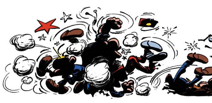
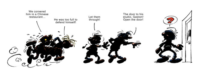
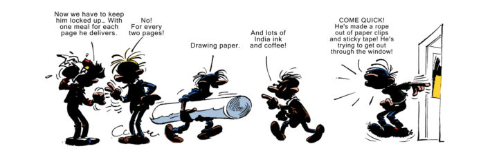
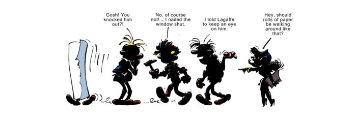
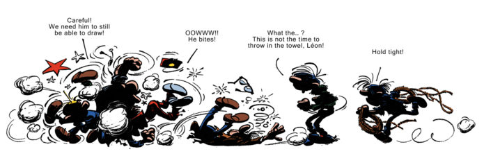
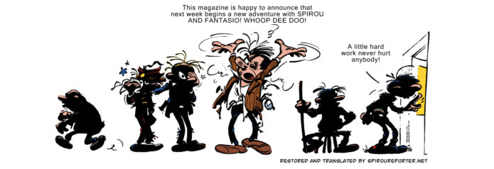
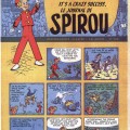
The week before the magazine serialization of a new Spirou & Fantasio adventure in the Journal de Spirou, Franquin used to draw a little teaser. In 1965 he was well and truly burned out on the series: it had been two years since the last new adventure, QRN sur Bretzelburg (Spirou & Fantasio #18, “QRN Over Bretzelburg”) which itself had been delayed for more than a year after his health collapsed. He kept drawing Gaston Lagaffe each week, but only reluctantly returned to the magazine’s flagship series, as this mini-comic illustrates. However, the result was Bravo les Brothers, which ended up as his own favorite Spirou & Fantasio adventure.
This scanlation has been scanned from the annotated edition of Bravo les Brothers (Dupuis 2012) and restored and recolored based on the original magazine publication, as reprinted in Franquin’s collected works from Rombaldi (Gaston Lagaffe vol. 5, pp. 1093–1094).



Did the original have typeface lettering like that, or is it an artistic choice?
By the way, “Bravo les Brothers” is the most Gaston-like of all Franquin’s Spirou adventures, it’s basically an extended Gaston story…
Yes, the typeset lettering is from the magazine publication. I would guess it was quicker than meticulously hand-lettering it, so it was often used outside of the “real” comics, such as in ads like this. I considered using a handtexting font, but decided to stick with the original look.
In fact, [i]Bravo les Brothers[/i] was included in a Gaston volume of Franquin’s Collected Works from Rombaldi, even though it appeared in a Spirou album.
Thanks. With these black figures, it seems to be a precursor of his Idees Noires, more than ten years later.