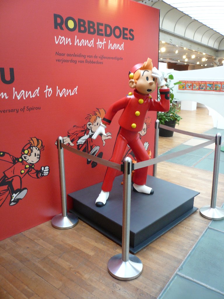
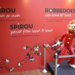
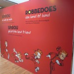
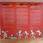
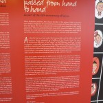
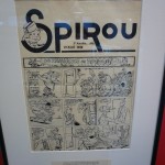
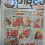
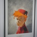
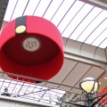
The Belgian Comic Strip Center (CBBD) in Brussels is currently hosting a temporary Spirou exhibition: Spirou passed from hand to hand. A few weeks ago I was able to attend it, and since it is now almost over (it closes on 6. October), here’s a photo report of that visit, so that it might encourage you to take this last chance to see it.
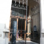
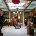
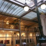
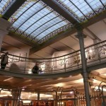
The Comic Strip Center is located in a beautiful restored Art Nouveau building by the famous architect Victor Horta. The immediate neighborhood is unfortunately rather uninviting, with deserted streets, empty store-fronts and a number of blocks being demolished. The best approach is definitely from up the hill, where you pass a big Gaston statue within view of the Center.
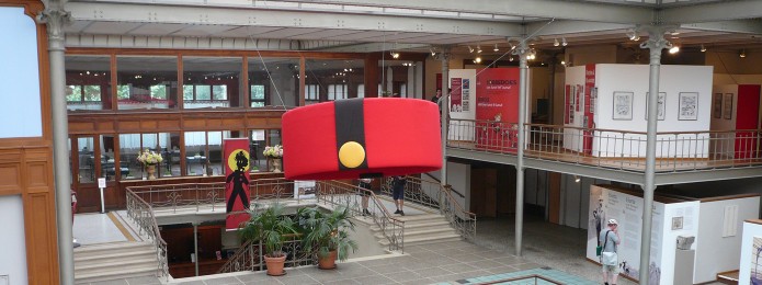
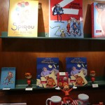
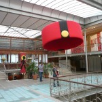
The Center itself covers four levels, with the ground floor devoted to a shop, a comics library (with extensive archives for researchers), and bistro. The rest is the museum with its various exhibitions. The mezzanine presents the history of comics, the different steps in comic production, and samples from various genres: the educational focus is clearly intended for school classes. The main floor primarily hosts a permanent exhibition focusing on Belgian comics and creators, which doesn’t seem to have changed since I last visited in the nineties, and is frankly looking a bit worse for the wear. This part of the museum is also missing captions in English, though folders with an English version of the text are available at the ticket counter.
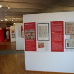
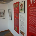
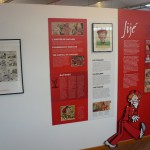
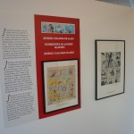
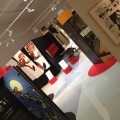
The upper balcony is reserved for temporary exhibitions, and it’s here we find the Spirou exhibit. In fact, it shares the level with an exhibition on Willy Vandersteen, the creator of Spike & Suzy (a comic which rivals Tintin in popularity in Belgium), whose centennial is this year. While not particularly crowded when I visited, it was better attended than these pictures might give the impression of, since I tried to avoid getting bystanders in the photos as much as possible.
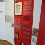
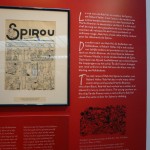
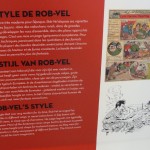
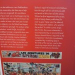
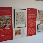
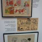
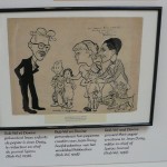
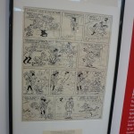
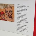
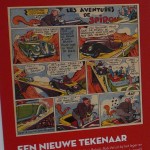
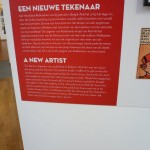
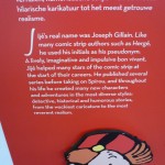
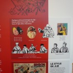
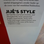
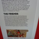
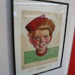
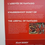
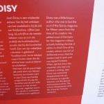
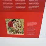
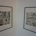
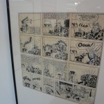
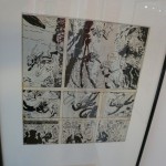
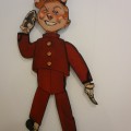
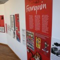
In keeping with its theme, the Spirou exhibition is arranged chronologically, artist by artist. Somewhat counter-intuitively, it runs from right to left, which I failed to realize at first, having started at the wrong end. I’ve re-ordered the photos to give a better sense of the intended progression of the exhibition. Apologies for the poor quality of the photos; after all, they’re not meant as a substitute for the real thing!
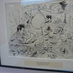
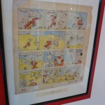
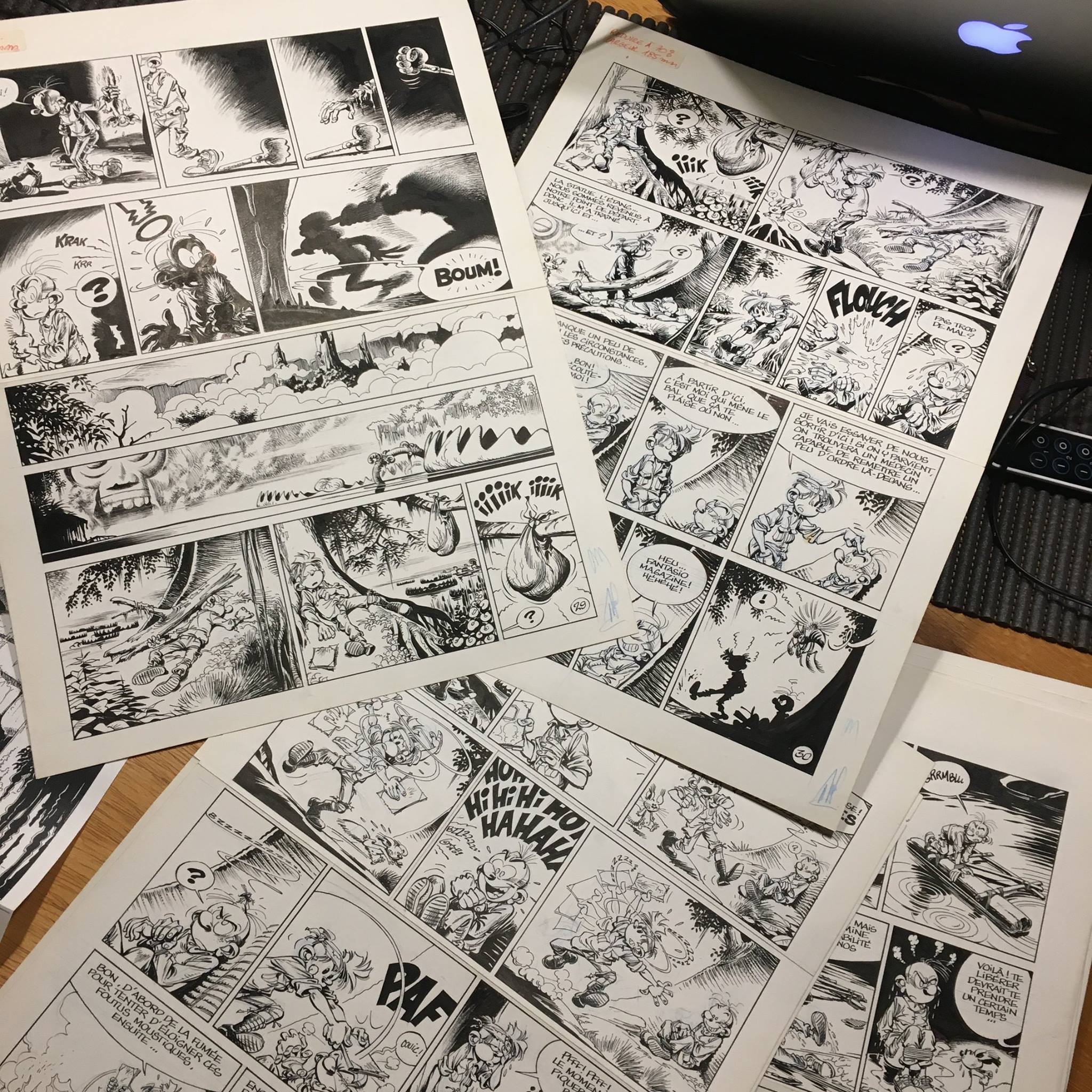
Since I knew most of the information presented already, the aspect of the exhibition I appreciated most was all the original art from throughout the history of the series. Studying it up close, seeing the corrections, seams, and pencil traces, and particularly to compare the techniques used by different artists side by side, was extremely gratifying.
Part 2 of the report will cover the Franquin section of the exhibition.


María Remersaro García liked this on Facebook.
Mathias Lorenz liked this on Facebook.
Achim Reinecke liked this on Facebook.
Helge Kvingedal liked this on Facebook.