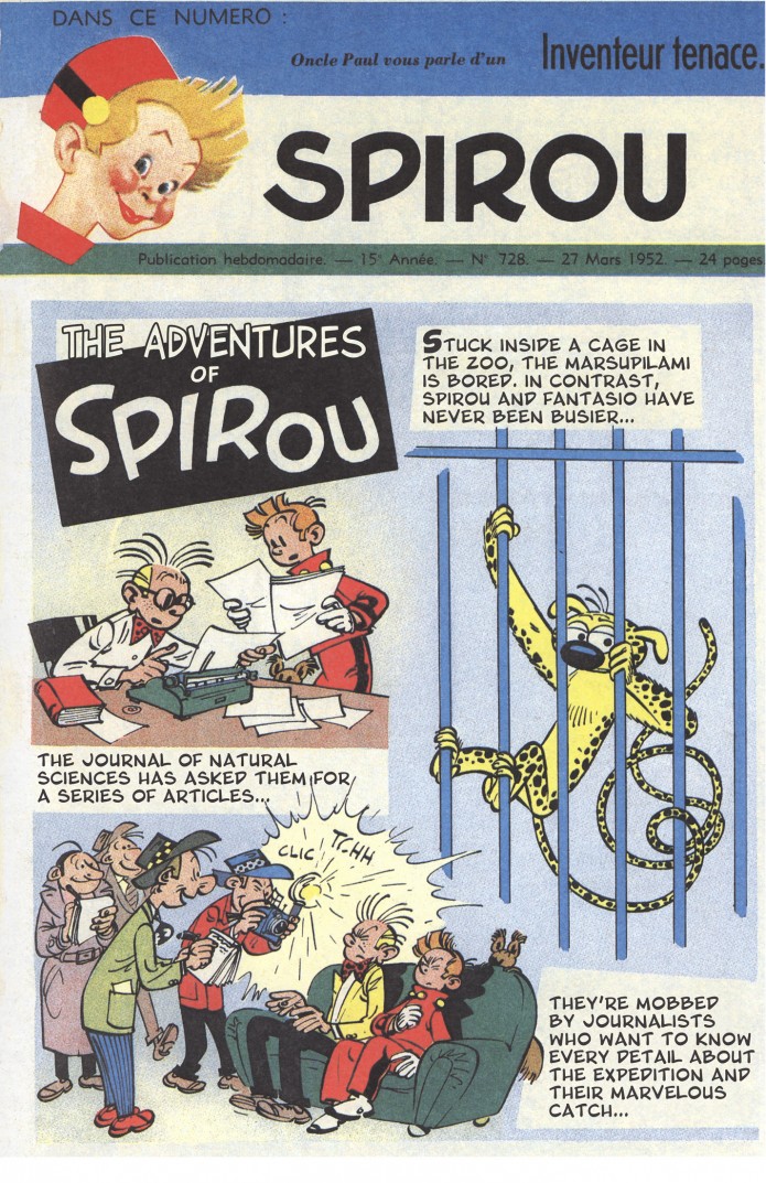
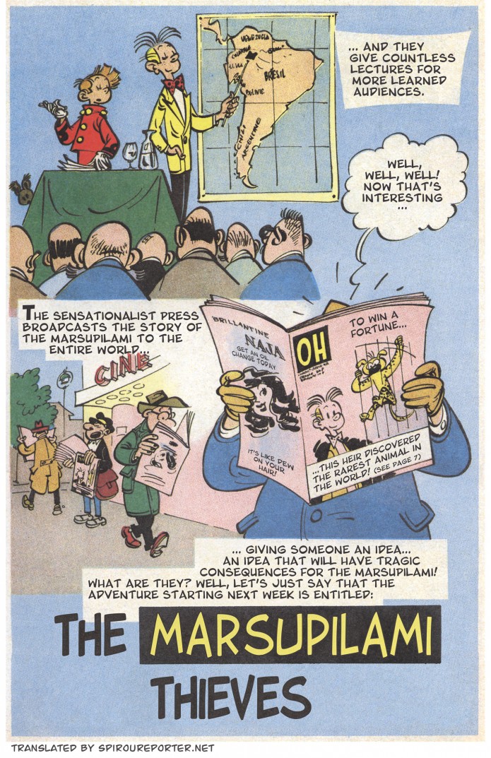
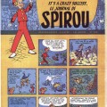
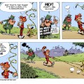
In 1952, the week before the first installment of Franquin’s Les voleurs du Marsupilami (Spirou #5), the magazine carried this teaser for the upcoming adventure. It was not included in the album when the story was collected, although it is reproduced (with some rather aggressive blur) in the intégrale collected edition.
Now that Cinebook has released the album in English as The Marsupilami Thieves, perhaps it can again serve its original purpose:
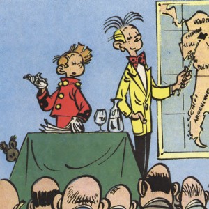
The two pages act as a bridge between the previous adventure, Spirou et les héritiers (Spirou #4, “Spirou and the Heirs”), and its sequel. An interesting thing to notice is that it shows the location of Palombia (the setting of parts of “Heirs” as well as several future adventures) on the map.
The scans are from Rombaldi’s edition of Franquin’s collected works, released in the 1980s.



Trond Gulvik Larsen liked this on Facebook.
Mathias Lorenz liked this on Facebook.
Ooh, thank you for this!
What fonts have you used here? They fit perfectly with the images, and I can only imagine how much work it is to seamlessly remove the original text.
Thanks Hamish. Yeah, it’s a fair bit of work, particularly on something like this where there’s a lot of noise or texture in the background, although there are some tricks in Photoshop to speed things up. I always try to find fonts that more or less match the original style, or at least look like they fit. For Franquin, I use [url=http://ufonts.com/fonts/blambot-pro.html]Blambot Pro[/url] for the basic lettering, with various others for shouts/effects/emphasis. The drop caps here are [url=http://www.dafont.com/comix-loud.font]Comix Loud[/url].
The titles were the trickiest part in this case. I love Franquin’s letter shapes, and had a hard time finding anything that came close. I was considering just leaving it, particularly since the way he emphasized “Marsupilami” at the end (using yellow and black to match the animal’s colors) doesn’t look as nice when the word comes on the first line. But in the end, I found that a bolded and slightly modified version of [url=http://www.fontsy.com/font_details_3897.html]Pet Bone[/url] gave acceptable results. You can have a look at the originals below:
Thanks for the font-links! I’m still developing my own lettering, so it’s great to find such lovely reference-points. Pet Bone, especially, looks great, and, even if it’s not exactly the same, certainly captures the feeling of the original.
Scanning these, getting rid of the moiré or shine-through backgrounds — yeah, that’s got to be a lot of work, but it is appreciated!
The amount of work needed really varies, and also depends on how picky you want to be. Stuff like the Marsupilami scan today are done in a few minutes (though it would take a bit more time to clean the colored caption boxes), others can take several hours to prep. Generally, the worse the quality of the source or the scan, the more time it takes to make it look good (as you might expect).
A quick-and-dirty job would take less effort, but since this is a hobby, why deliver something I’m not satisfied with? Not that I am 100% happy with all – or perhaps with any – of the site’s scanlations (for example, in this case I would have loved to get a closer approximation of the big, dynamic, upwards-swooping loops on Franquin’s R’s and P’s, which are such a characteristic aspect of his typography), but at some point you have to say enough is enough; you can’t let the perfect be the enemy of the good.
Still, while I do it mostly for my own enjoyment, it’s gratifying that the effort is appreciated. So thanks again!
Helge Kvingedal liked this on Facebook.
Sarah Joy liked this on Facebook.
Euro Comics Roundup liked this on Facebook.
María Remersaro García liked this on Facebook.